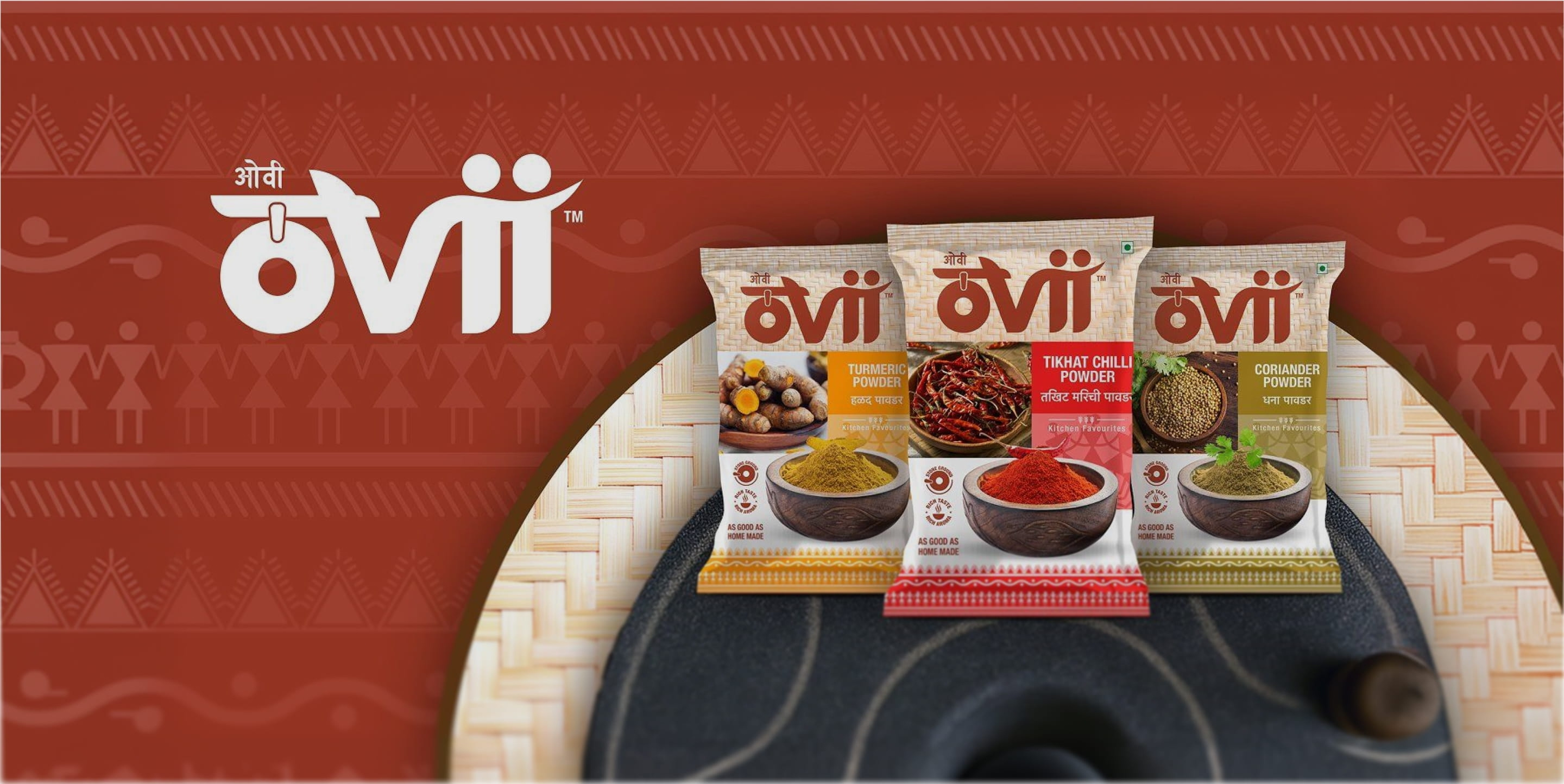

Shelke Foods Pvt. Ltd. is a Pune based food company (part of the Shelke Group) rooted in everyday Maharashtrian cooking. With 10+ years in food manufacturing & packaged spice blends, known for stone ground, traditional flavour, they were ready to become more distinctive & premium in recall. Ovii is that step: a sharper, more trusted kitchen name designed to scale beyond one hero product into a broader range of essentials.
The brief: Create a name, visual identity, packaging system, and launch plan for the brand. Establish a distinctive and cohesive foundation that stands out on shelf, communicates its value clearly, and builds strong recognition from launch. Set the direction for a brand that can scale confidently over time.
The soul of Ovii comes from women’s ovi, work songs that turned routine into rhythm, and hardship into voice. That spirit becomes the brand’s backbone: culturally specific, emotionally real, and built to stand for more than taste. Not just spices for recipes, these are spices with a point of view.
When Ovii set out to enter the spice aisle, it didn’t begin with cumin or chilli. It began with a song.
In Maharashtra, ovi are short, improvised verses sung by women as they work at the grinding stone, the mortar and pestle, the water wheel. Fragments of love, frustration, humour and hope, carried on everyday rhythms.
Ovii wanted to embrace that spirit. Our job was to turn it into a brand.
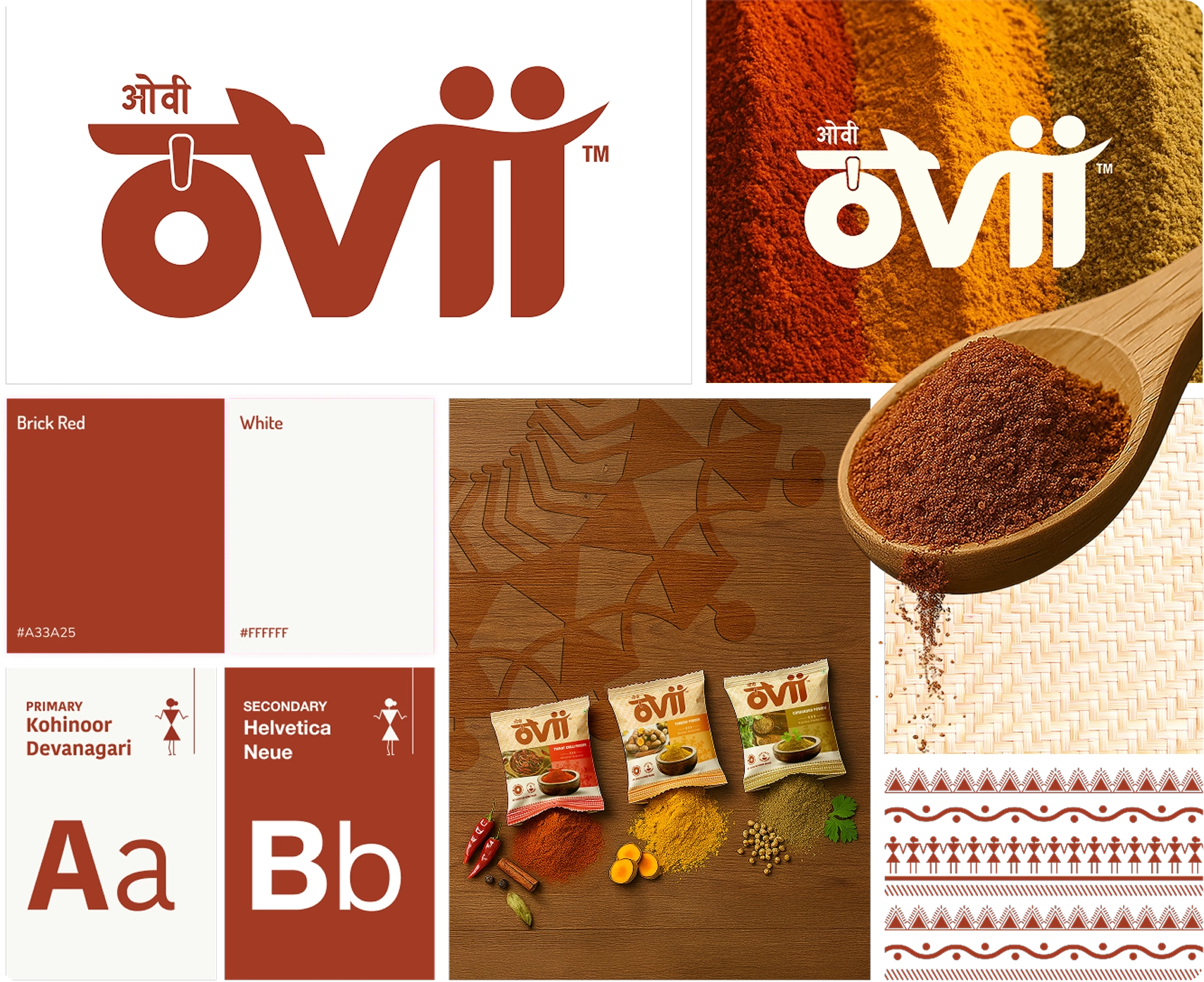
The Ovii identity lets logo and colour tell one story: people and earth, held with care.
The custom wordmark weaves women into its forms, the “o” echoing a stone grinding wheel, the two “i”s like figures standing together. While a warm terracotta, deep green and generous white space keep it grounded, human and quietly confident on shelf.
Together, these elements create a distinctive yet restrained presence that feels rooted in tradition, purposeful in meaning, and unmistakably contemporary in execution.
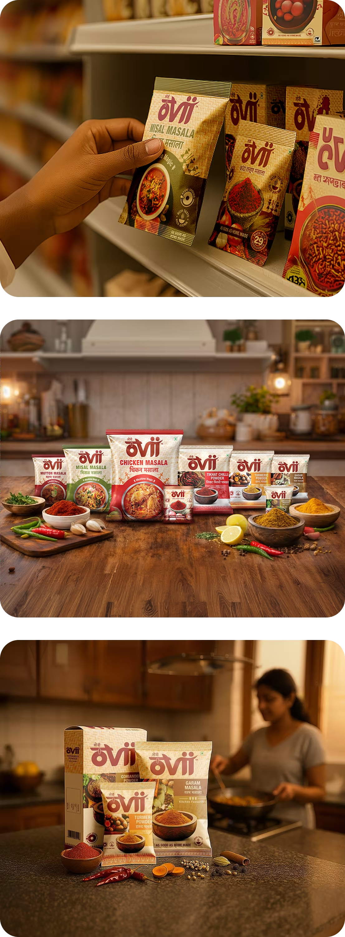
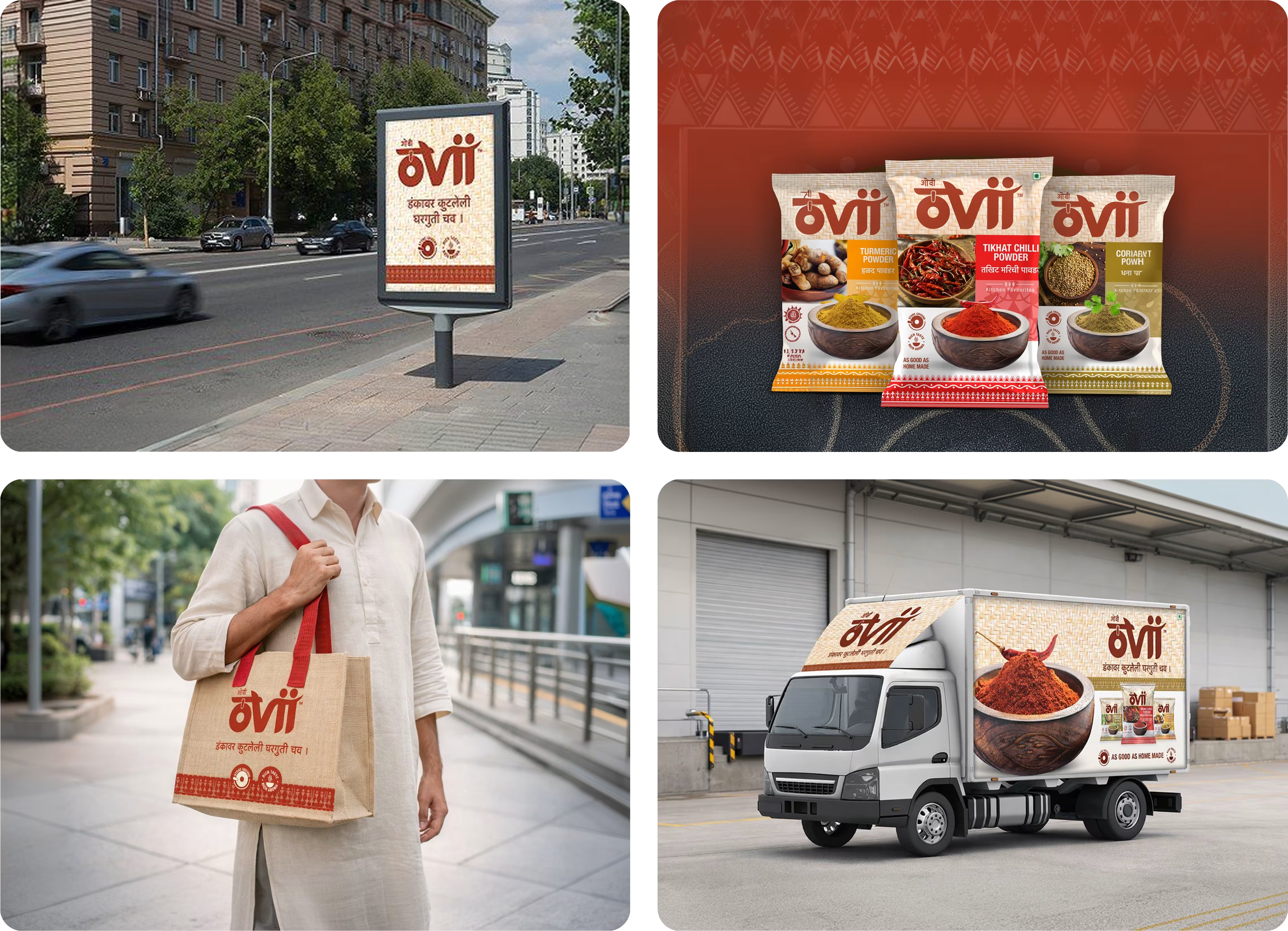
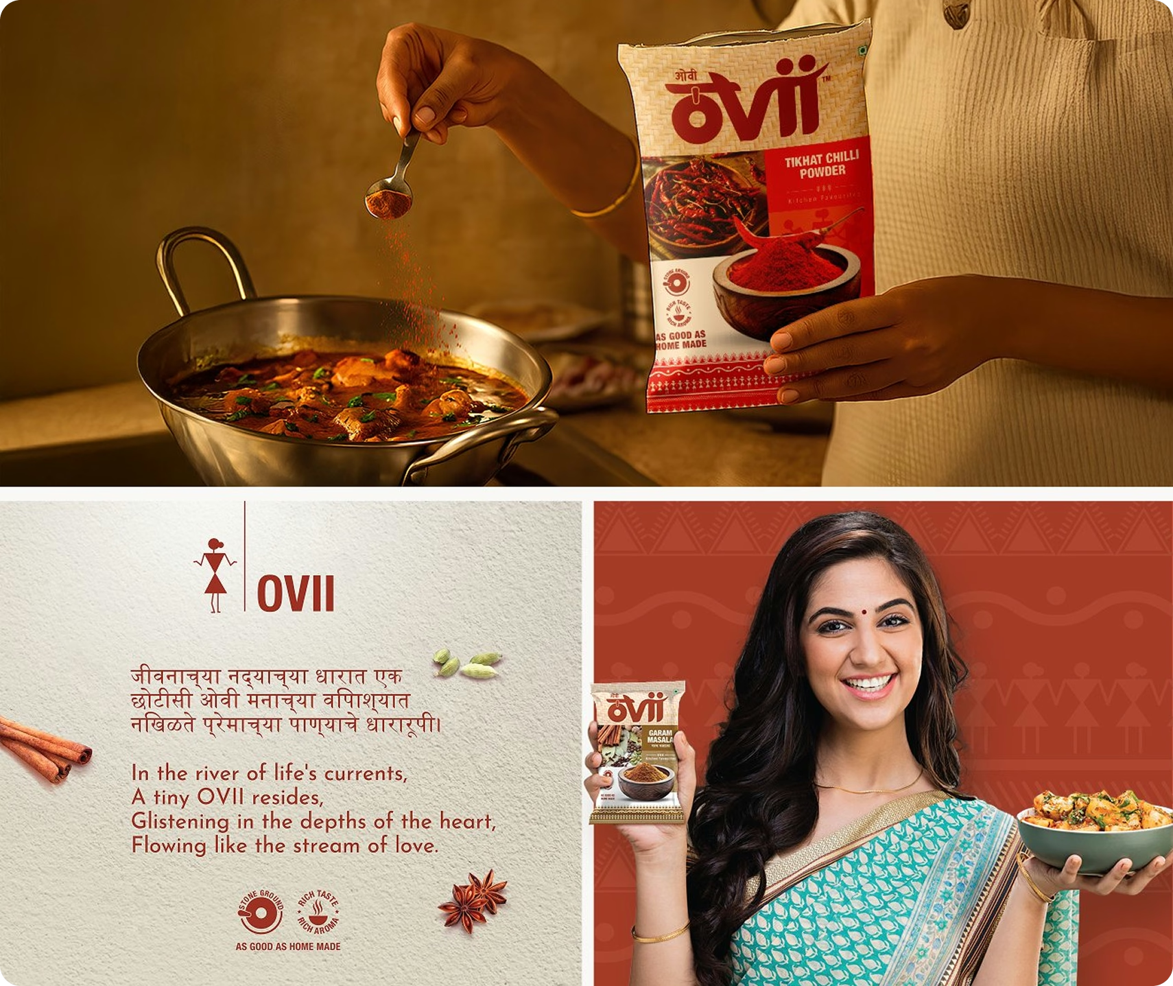
We carried Ovii’s women-led story into every place the brand appears. On shelf, the terracotta spine and clear architecture create an unmistakable Ovii block; at retail, dealer boards extend the same warmth into the chaos of the market.
In the kitchen and online, short ovi-like lines, white space and textile-inspired details keep a woman’s everyday voice present. This makes the brand feel less like packaging, and more like a quiet companion to her day.